
The other day a customer asked how much trouble it would be to chart some data in an Alfresco Share dashlet. The data comes from a non-Alfresco REST API.
The answer is that it is relatively easy to do. That’s because Alfresco Share ships with some basic out-of-the-box chart widgets called BarChart, DonutChart, and PieChart. You may have seen examples of dashlets that use PieChart if you’ve ever added the Site Content Breakdown or Site Contributor Breakdown dashlets to your Share dashboard.
In this blog post, I’ll show you how to make your own chart dashlets by shamelessly stealing Erik Winlöf’s code that implements the Site Content Breakdown dashlet and modifying it for our own purposes to show sales data, by region, in a dashlet. In part one, the data is fetched from a repository tier web script. In part two, the data comes from a Spring Boot app.
Steps
This code is available in GitHub. Each of the steps below is tagged. After you clone the repository you can switch between steps by doing git checkout step1 or git checkout step2 etc.
If you are going to follow along, clone the project:
git clone https://github.com/jpotts/alfresco-share-chart-example.git
Then, checkout step0:
git checkout step0
And startup the project using Docker and Docker Compose:
./run.sh build_start
This will start up Alfresco using Docker with no customizations made at this point.
Step 1: Add a simple API to return the data to chart
If you are following along:
git checkout step1
If Alfresco is already running:
./run.sh reload_acs
We want to build a dashlet that can chart data fetched from an API source. So, to start, we’ll add a repository tier web script that returns data as JSON. Once the chart is working we can swap that out to an external data source.
The files that make up the web script are:
- data.get.desc.xml: Sample data web script descriptor.
- data.get.js: Sample data web script controller sets the data on the model.
- data.get.json.ftl: Sample data web script view template renders the model in JSON.
With the web script in place, invoking http://localhost:8080/alfresco/s/custom/data will return a JSON response with sales broken down by region, like this:
     {
         "resultset": [
           [
                 "West", 125
             ],
             [
                 "North", 75
             ],
             [
                 "East", 250
             ],
             [
                 "South", 150
             ]
         ],
         "metadata": [
             {
                 "colIndex": 0,
                 "colType": "String",
                 "colName": "name"
             },
             {
                 "colIndex": 1,
                 "colType": "Numeric",
                 "colName": "sum"
             }
         ]
     }
The format of the JSON is what the chart component expects–it includes a resultset property, with a list of data values, and a metadata property, which describes the data types found in the result set.
If you need exact steps on how to create a web script, see my webscripts tutorial.
Step 2: Add a dashlet
If you are following along:
git checkout step2
If Alfresco is already running:
./run.sh reload_share
In this step, add a dashlet. Share supports the old “Surf” way to add dashlets as well as the newer “Aikau” way to add a dashlet. Because we’re going to use an Aikau widget for the chart, we’ll use the Aikau approach for the dashlet.
Dashlets are implemented using web scripts, so we’ll need a descriptor, controller, and view template:
- sales-summary-chart.get.desc.xml: Sales Summary Chart dashlet descriptor.
- sales-summary-chart.get.js: Sales Summary Chart dashlet controller puts the dashlet widget on the model.
- sales-summary-chart.get.html.ftl: Sales Summary Chart dashlet view template renders the dashlet (or at least the container that will hold the dashlet content).
This is an Aikau dashlet, so in addition to the dashlet web script, we need an Aikau widget, implemented in client-side JavaScript, that sets up the dashlet:
- share-chart-example.xml: Share data extension that declares the client-side JavaScript implementation files.
- CustomReportDashlet.js: Placeholder Aikau dashlet implementation.
- CustomReportDashlet.properties: Dashlet properties file. This is where the dashlet title is set.
Now log in to Share at http://localhost:8180/share, create a test site, and customize the site’s dashboard to add the newly-created dashlet.
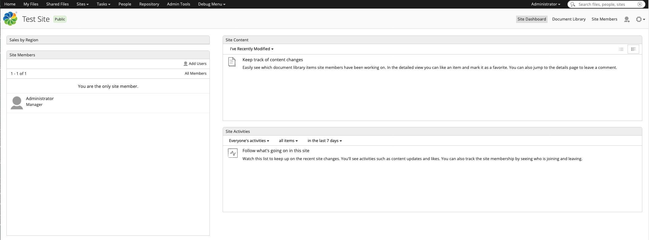
It doesn’t have anything in it yet because we need to define a service to fetch the data and a widget to display it. That’s the next step.
Step 3: Add a widget and a service
If you are following along:
git checkout step3
If Alfresco is already running:
./run.sh reload_share
The last step is to add an Aikau service to fetch the data and an Aikau widget to display the data fetched by the service. The widget will use the out-of-the-box pie chart widget to display the chart.
First, we write an Aikau service to fetch the data from the API and publish it to a topic:
- CustomReportService.js: Aikau service that fetches the data and places it on a topic.
- CustomReportService.properties: An empty props file that probably isn’t needed.
Then, we write an Aikau widget that subscribes to the topic and renders the chart using the PieChart widget:
- CustomReportWidget.js: Aikau widget that watches for report data placed on the topic and renders it using the out-of-the-box PieChart component.
- CustomReportWidget.properties: Widget properties file that is used to externalize the chart tool tip.
The dashlet controller we implemented earlier needs to be updated to refer to the new service:
- sales-summary-chart.get.js: Updated to add new service to services array.
And the Aikau dashlet code needs to be updated to point to the new widget:
- CustomReportDashlet.js: Updated to add CustomReportWidget to widgetsForBody array.
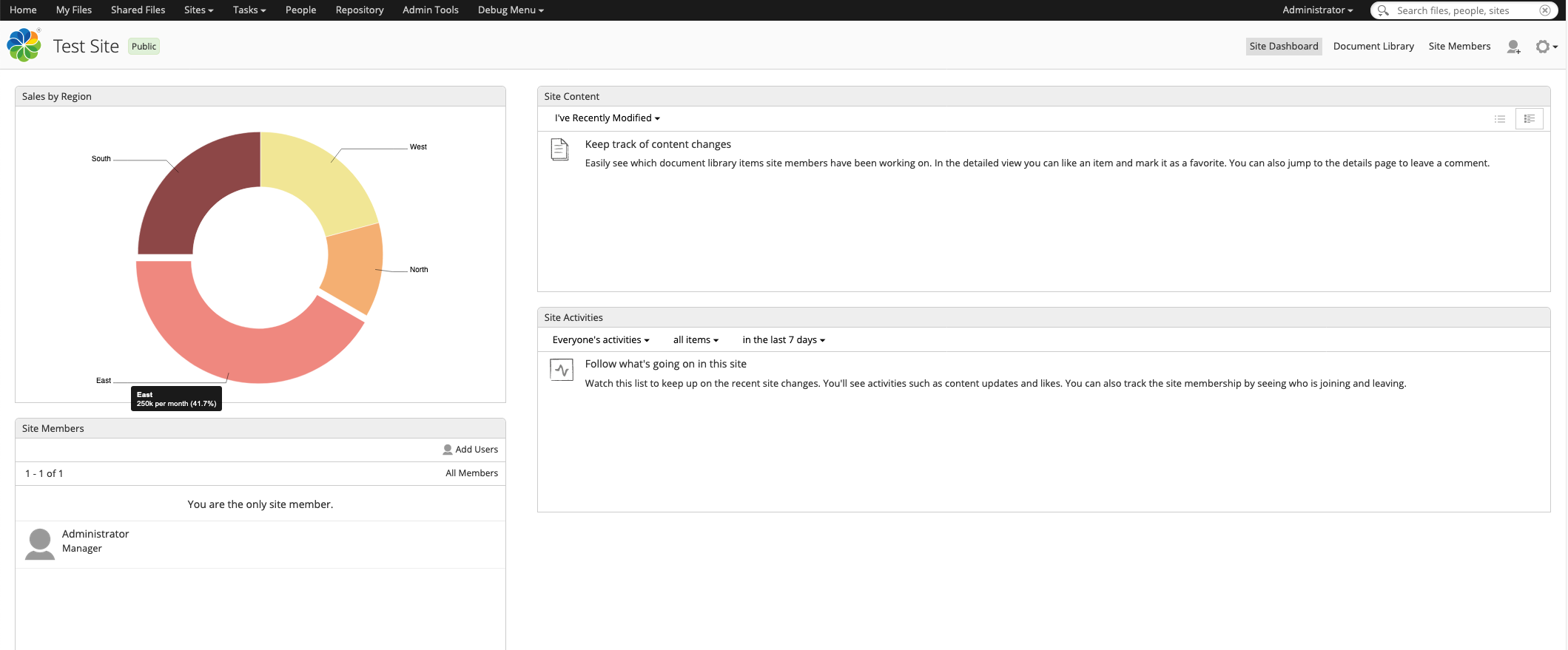
Now when the dashlet renders, it fetches the data from the repository tier web script and presents it in a pie chart.
Hovering over each slice in the pie chart produces and overlay with the detailed data.
Part Two Preview
In Part Two, we’ll create a little Spring Boot application that the dashlet will call to fetch its data instead of fetching it from the repository tier. The Spring Boot app will authenticate the request using the authenticated Alfresco user’s ticket, so that only authenticated Alfresco users can fetch the data from the API.
One comment
Comments are closed.